In his voyage to New Zealand, the legendary explorer Kupe was said to be accompanied by the Taniwha named Tuhirangi. Kupe traveled through Raukawa, also known as the Cook Strait, a body of water that separated families and lovers as the brave few crossed the perilous waters to venture South. When Kupe learned of a man who had recently been lost to the crossing he placed Tuhirangi nearby as a guardian to help protect other seafarers.
Much like Tuhirangi, Creative HQ adheres to the principles of Kaikiakitanga, taking on the mantle of guidance and guardianship. By working in partnership with entrepreneurs, and fellow innovators, Creative HQ acts as a navigator for those who are ready to embark upon a journey.
Much like Tuhirangi, Creative HQ adheres to the principles of Kaikiakitanga, taking on the mantle of guidance and guardianship. By working in partnership with entrepreneurs, and fellow innovators, Creative HQ acts as a navigator for those who are ready to embark upon a journey.
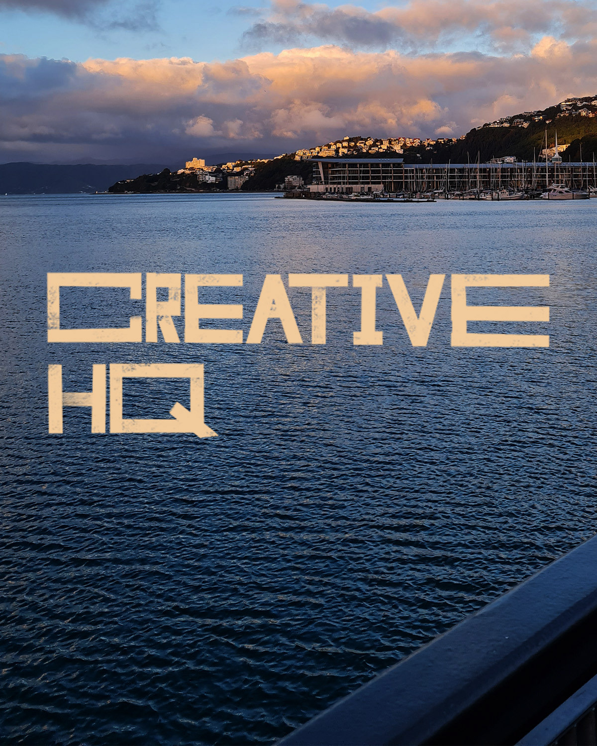
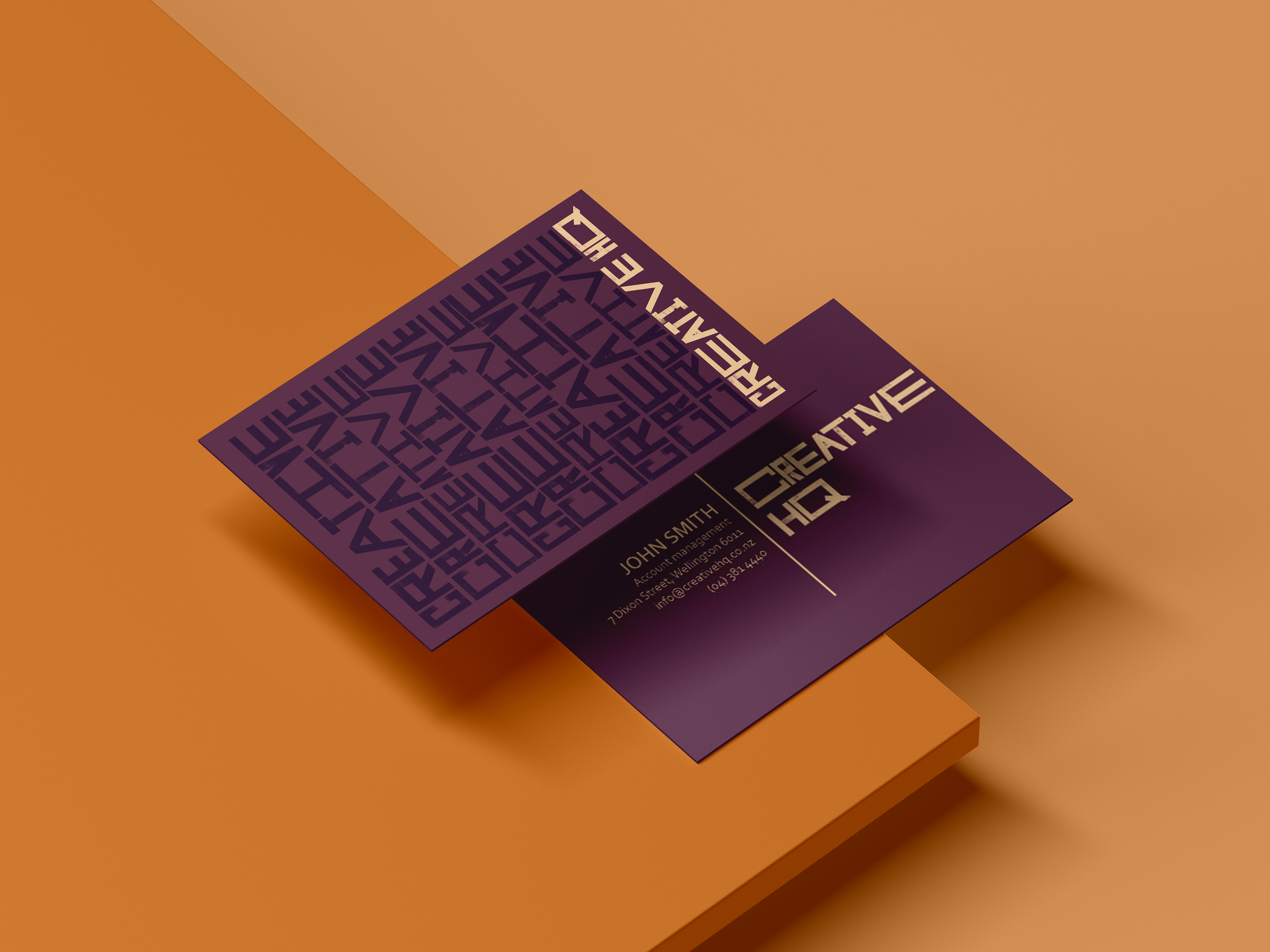
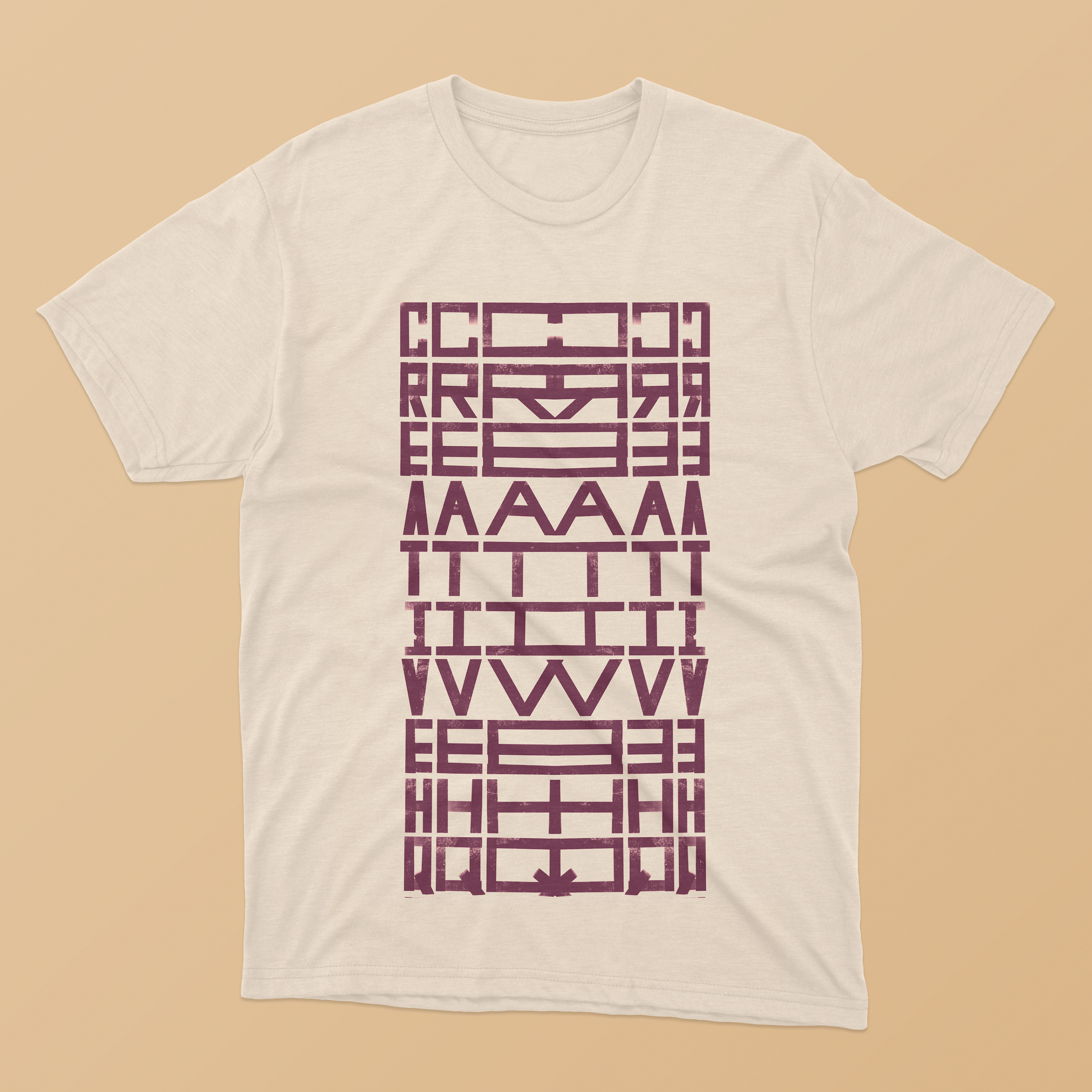
This logo is the product of type exploration. By using a staggered grid, the push and pull effect with each of the individual letters was created. The letters were all hand drawn to retain the handmade playful quality.
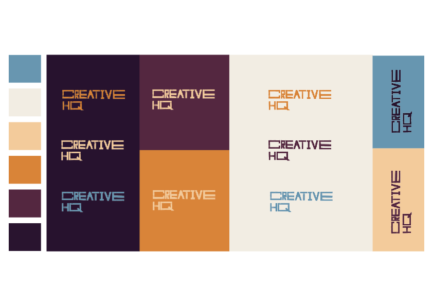
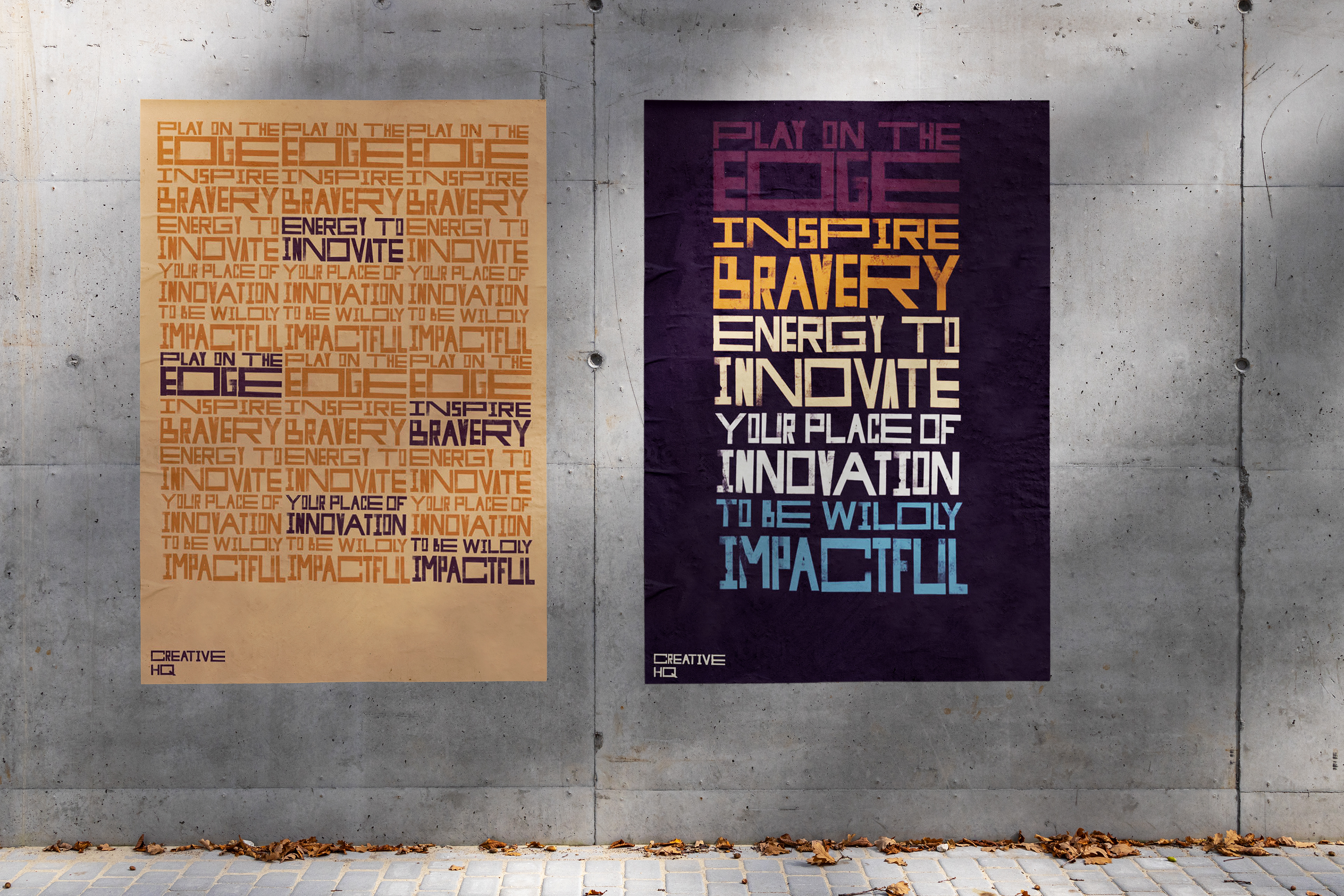
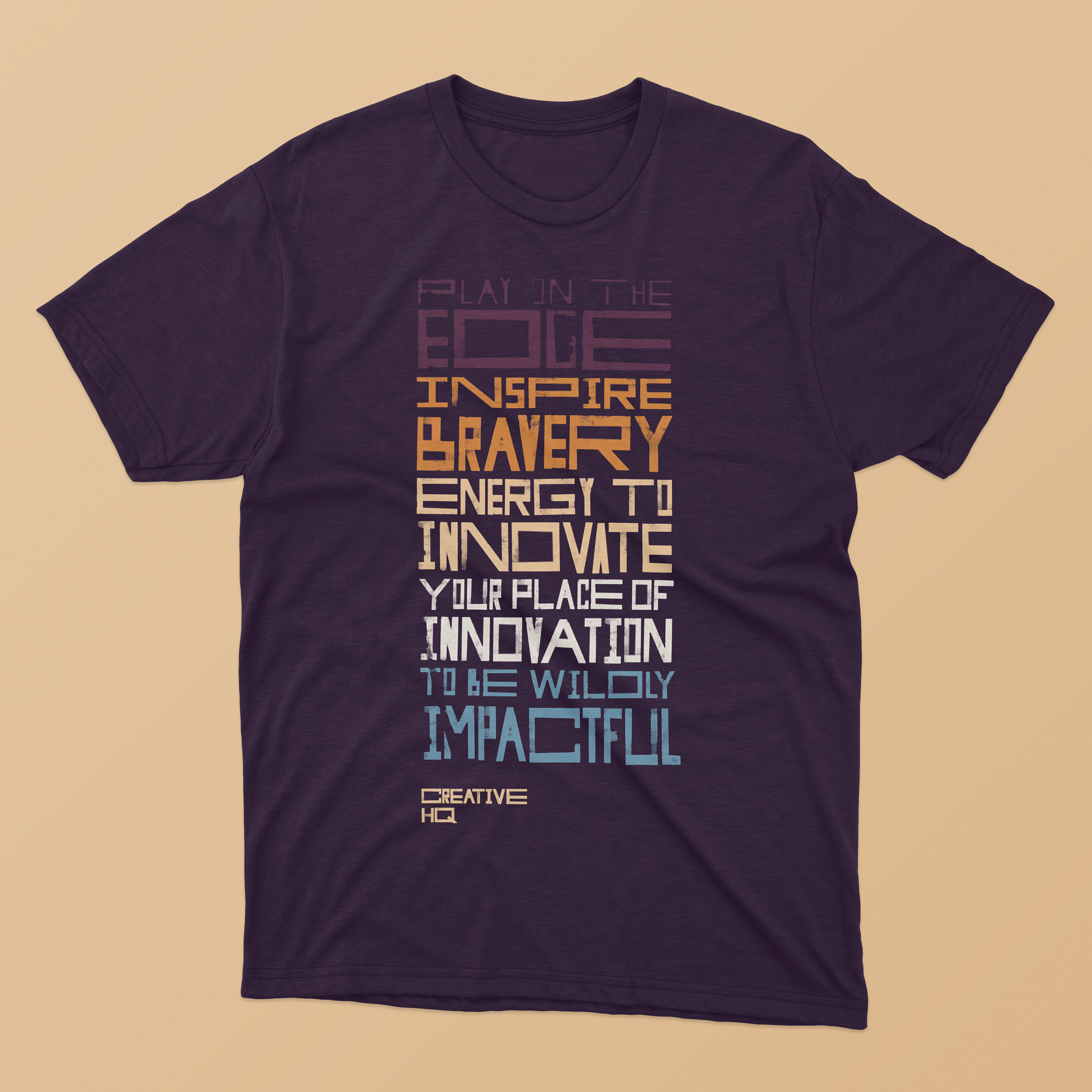
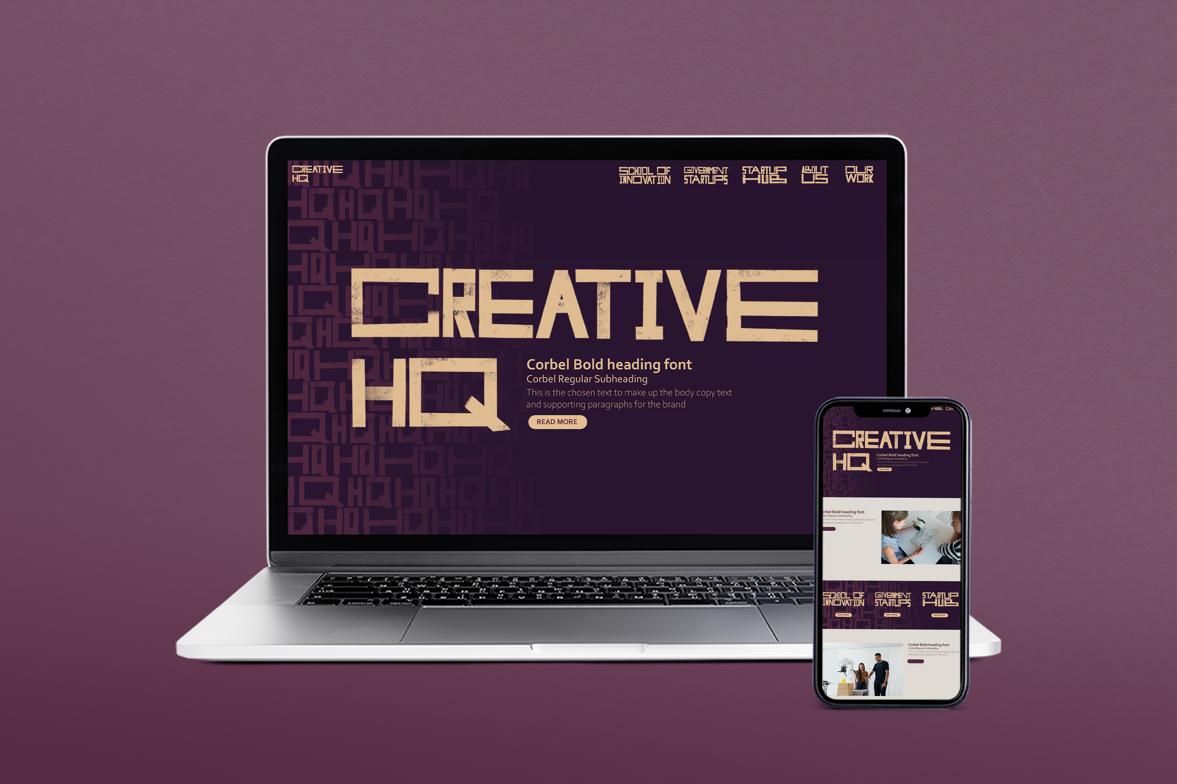
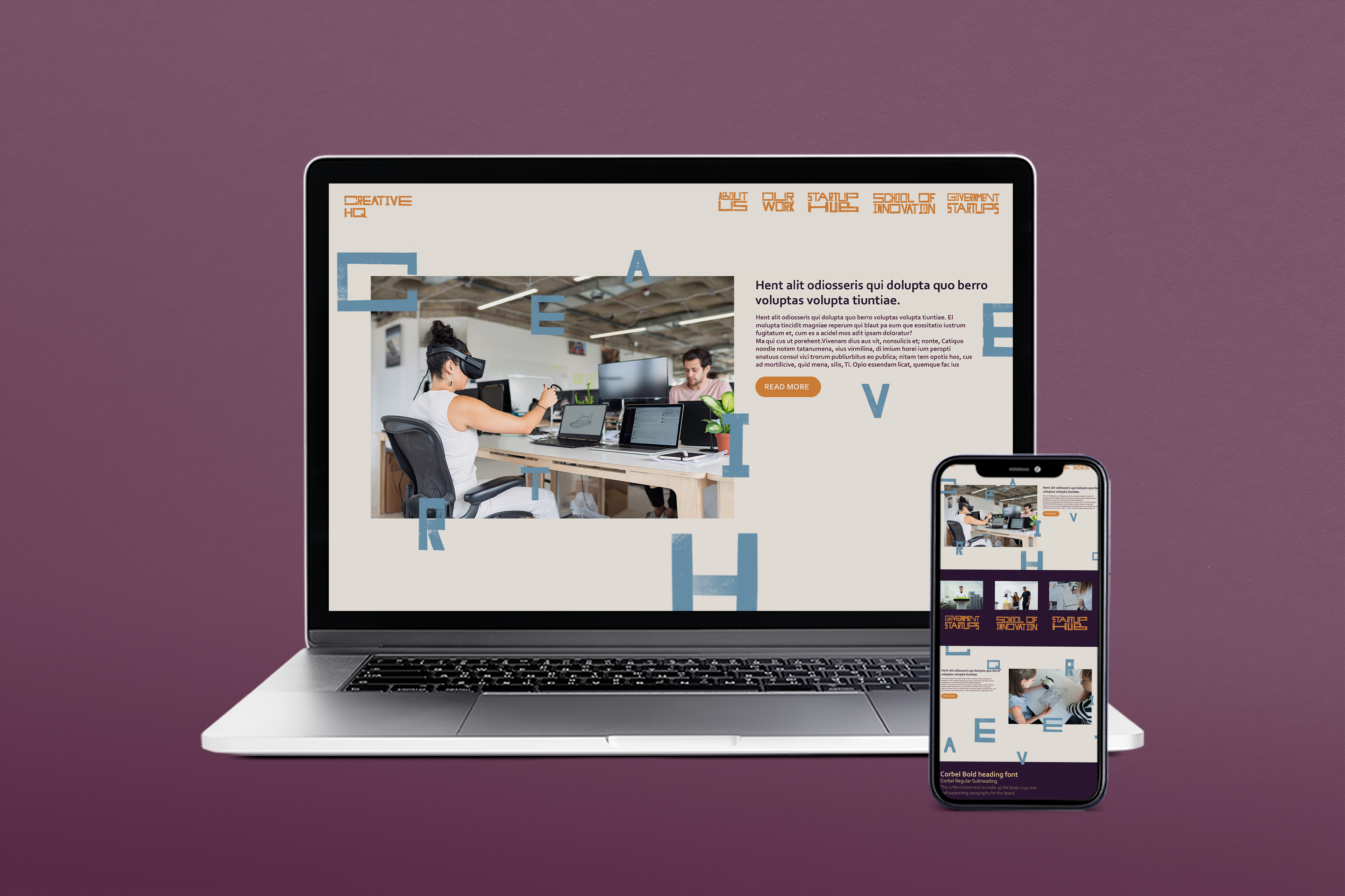
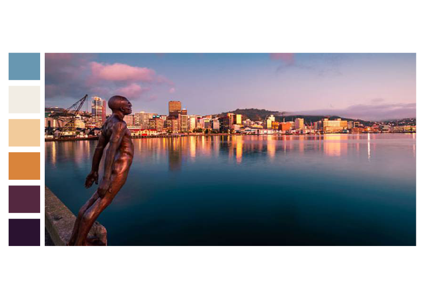
To continue the narrative of Tuhirangi throughout the colour scheme, the colours have been selected from Wellington Harbour. These have high contrast while retaining a warmer tone. The off-white and dark purple tones act as a neutral background and body copy text colours. Purple and orange have been chosen as they exist in a colourspace currently unused by brand competitors and act as a contrasting focal point. Light blue and light yellow are supporting colours used mainly for differentiating headings.
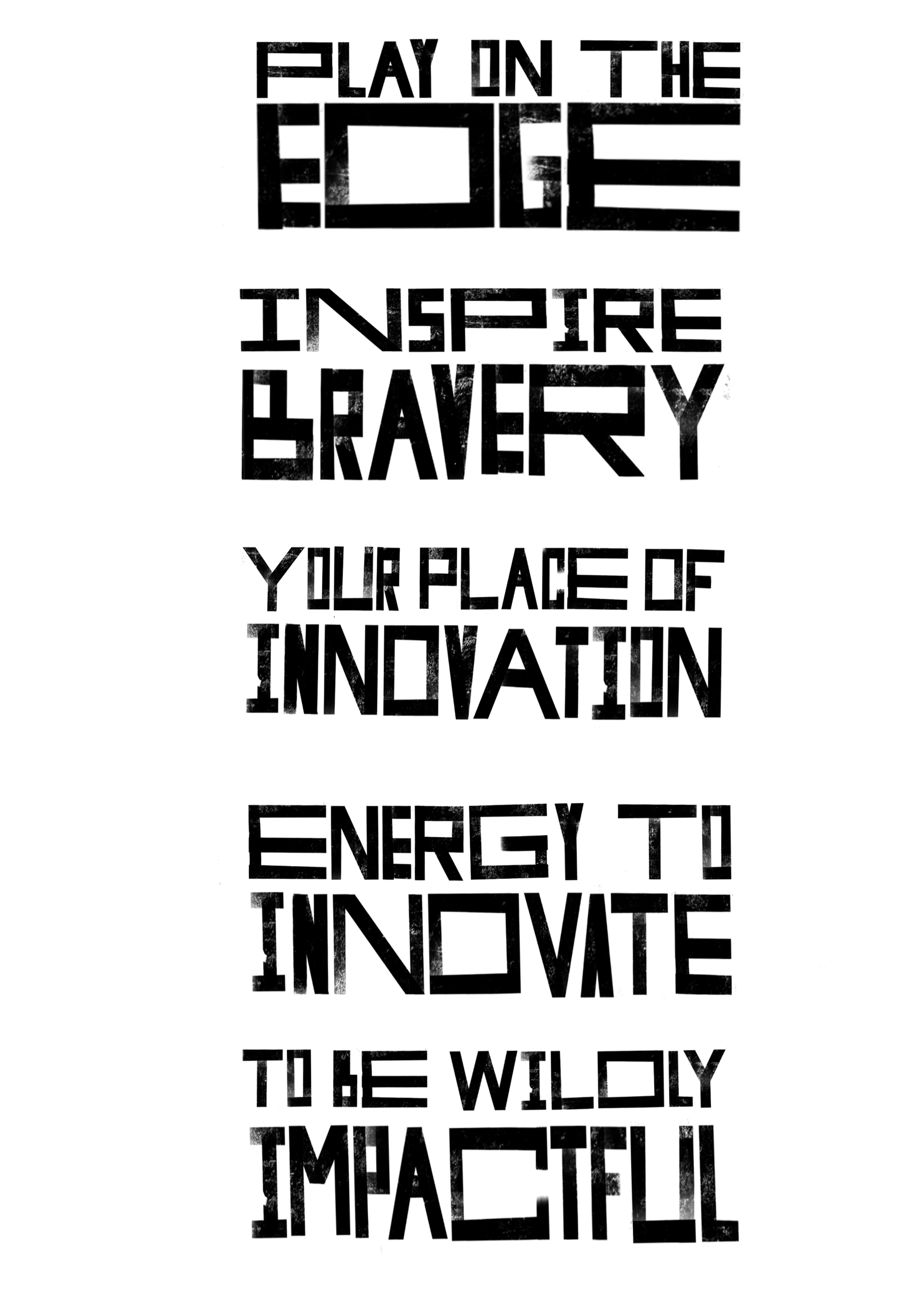
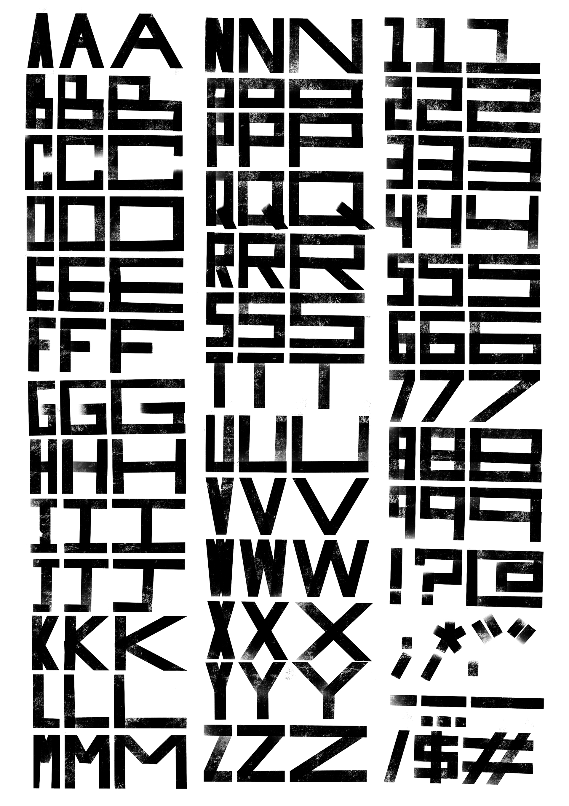
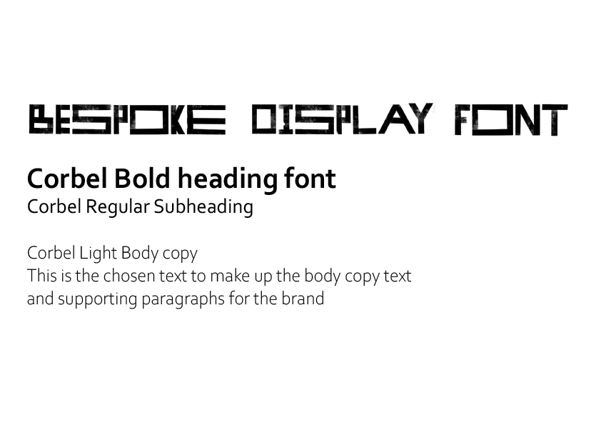
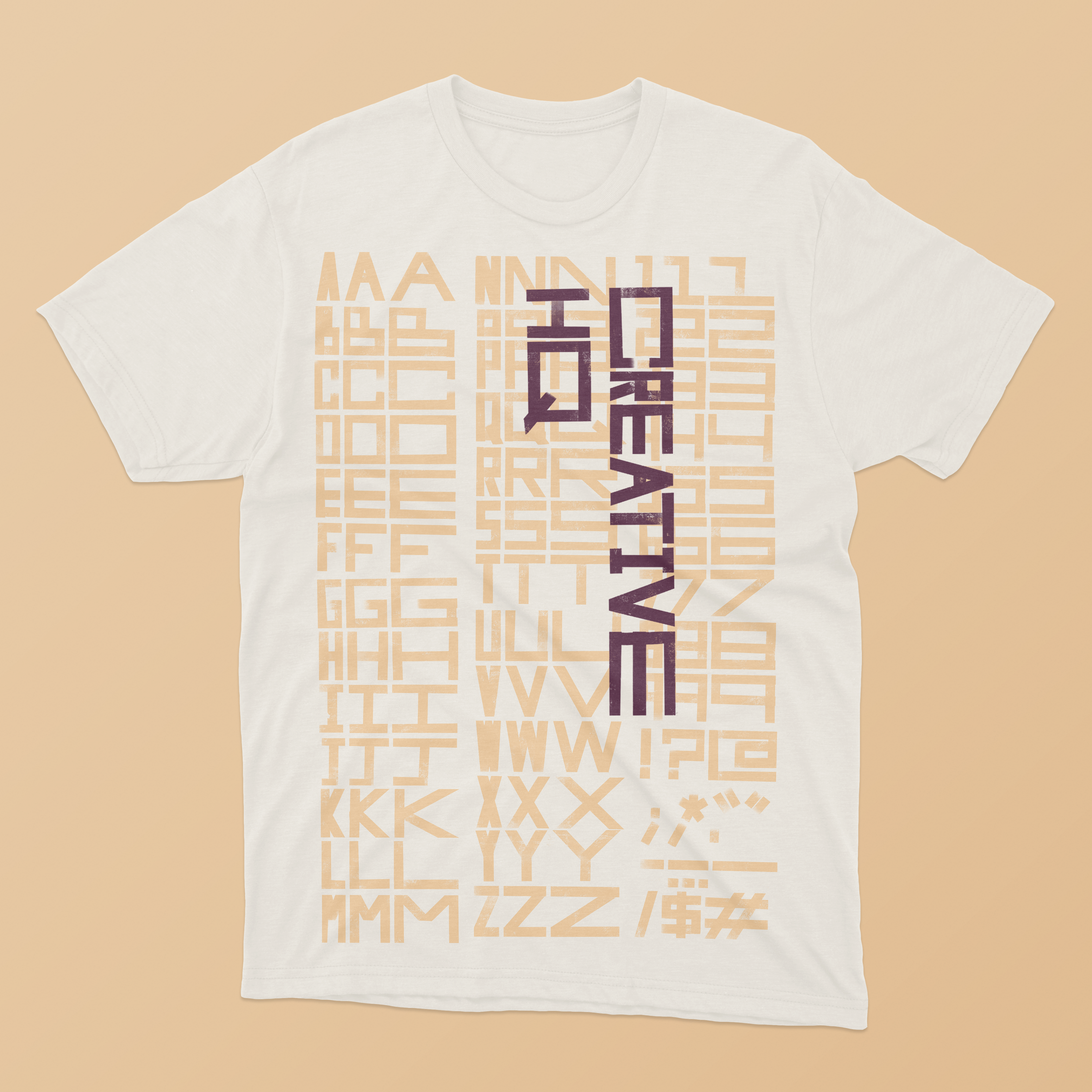
The font is bold, blocky, and digitally hand-drawn. Three versions of each letterform were created so that all type and headings could be assembled in a playful experimental way, re-arranging the letters in different ways for effect.
